

When I started working on Spot I had no idea how quickly everything would shift. We soon pivoted to Noxus, aiming to build an operating system to help organizations build and manage their AI workforce with limited technical knowledge and overhead. This new direction called for more than just a refreshed vision; it required us to completely rethink our design language.
The main challenge was that nothing about the old branding fit our new goals. Spot’s playful, vibrant look made sense for influencer marketing but felt off-track for Noxus, which needed to appear more mature, forward-looking, and authoritative. For quite a while, I was the only designer on a small team, so delivering features for customers took priority over aesthetic updates. As a result, we kept pushing our design overhaul to the back burner—until we couldn’t anymore.
Defining the New Brand Identity
Once we finally had the bandwidth to focus on the new brand, we realized it meant much more than swapping out logos and color palettes—it required a complete design system overhaul. We needed to establish consistent styles across the board, from typography to core layout patterns. This groundwork would influence everything from the product interface to marketing assets, ensuring our look and feel stayed unified.
One major insight was the importance of a well-structured component library for the frontend team. Without pre-built elements, every new feature turned into a one-off design and development effort, slowing us down and creating inconsistencies. Investing in a robust, reusable library not only streamlined our UI and strengthened our brand identity but also accelerated our product roadmap. Developers could pull from a catalog of approved, on-brand components, freeing them to focus on new features rather than reinventing the same buttons and forms.
Of course, in a small, tight-knit team of eight, every voice has weight. Balancing everyone’s vision for our new identity was tricky, but that collaboration helped refine our ideas until we landed on a central concept of “cells.” We liked how cells represent the building blocks of living organisms—an apt metaphor for how Noxus integrates deeply into an organization’s infrastructure, providing the core modules that power AI-driven transformation.
Translating the Brand into a Design System
With our new brand identity in place, the next challenge was to translate it into a cohesive design system—no small task, considering our existing UI mixed mismatched purples with oversized buttons. There seemed to be an endless list of details to fix. Fortunately, the brand book became our guiding light: instead of second-guessing choices about colors, typefaces, or button styles, we had clear rules that kept our visuals aligned with Noxus’s values of maturity, clarity, approachability, and innovation.
We looked to industry-leading design systems for guidance:
- Polaris by Shopify, for its clean, structured approach.
- Atlassian Design System, for its scalability and consistency.
- Spectrum by Adobe, for its flexibility and meticulous documentation.
- Linear’s design language, for its minimalist and modern aesthetic.
Drawing on these references, we structured our components, established interaction patterns, and set up accessibility guidelines. We also introduced design tokens for color and spacing, standardized our typography scales, and built a robust library of reusable UI elements. This all made it easier for our developers to ship features faster, without reinventing the wheel every time. Ultimately, our design system not only brings Noxus’s brand identity to life but also streamlines how we build and evolve the product.
The final results
After consolidating our brand guidelines and learning from industry best practices, we put everything into action. We introduced a standardized UI kit, complete with:
Documentation and Guidelines: A living design documentation site helps new teammates quickly adapt, and keeps our developers aligned with the latest design updates.
Scalable Layouts: By using a grid-based structure and responsive breakpoints, our interface adapts to different screen sizes while maintaining the same polished feel.
Reusable Components: Core elements like buttons, cards, and modals were built to be modular and easily configurable. This approach not only sped up development but also helped ensure uniform styling.
Design Tokens: A single source of truth for colors, spacing, and typography, making it easier to maintain consistency across all screens.
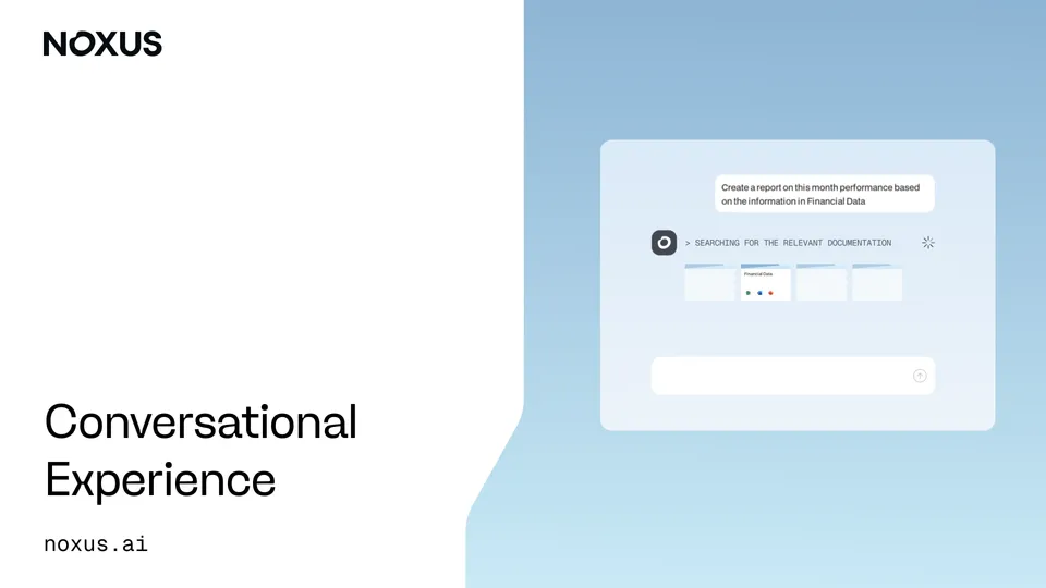
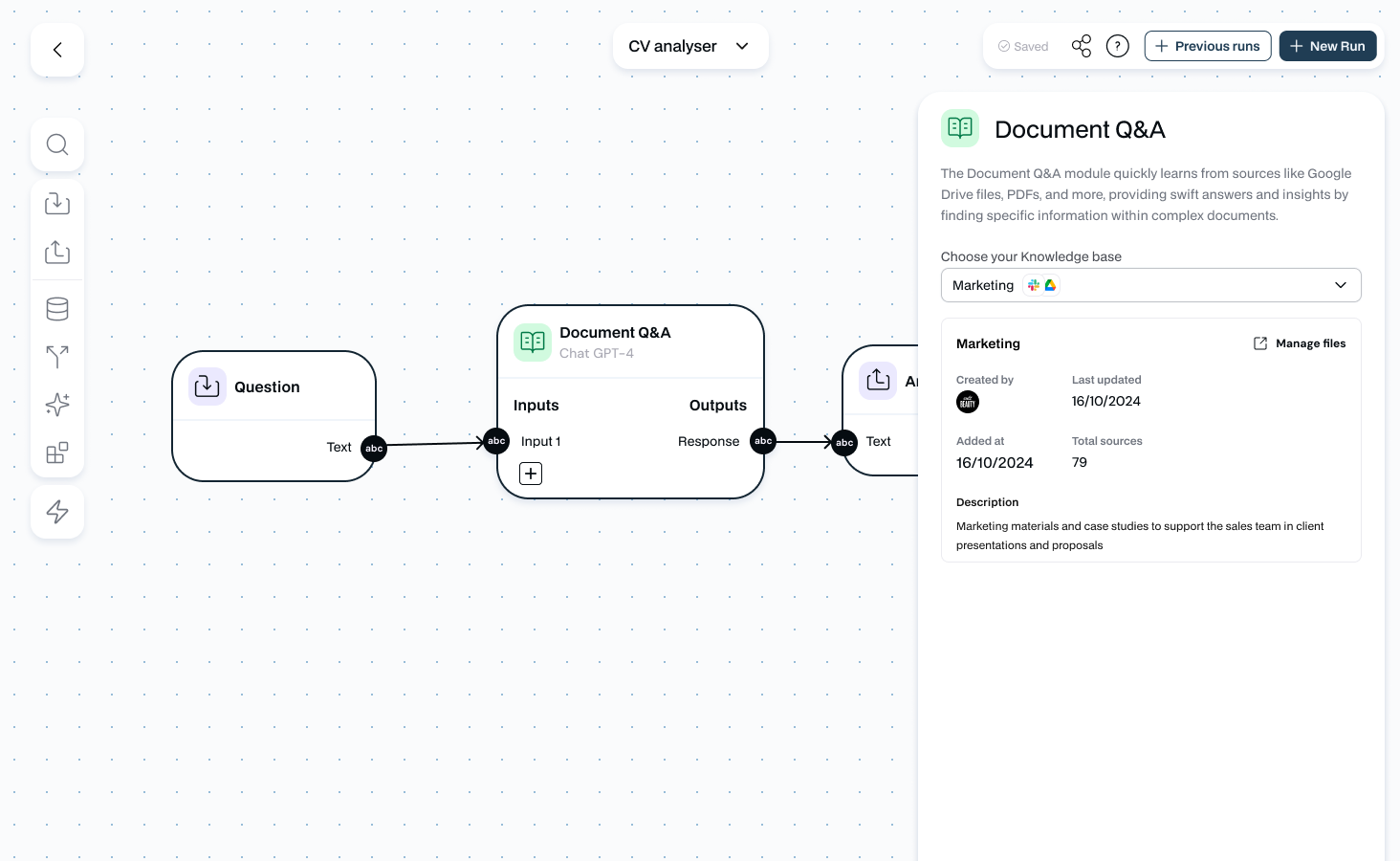
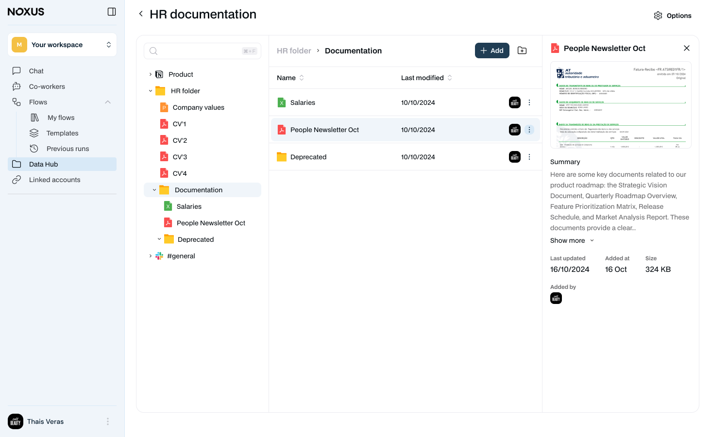
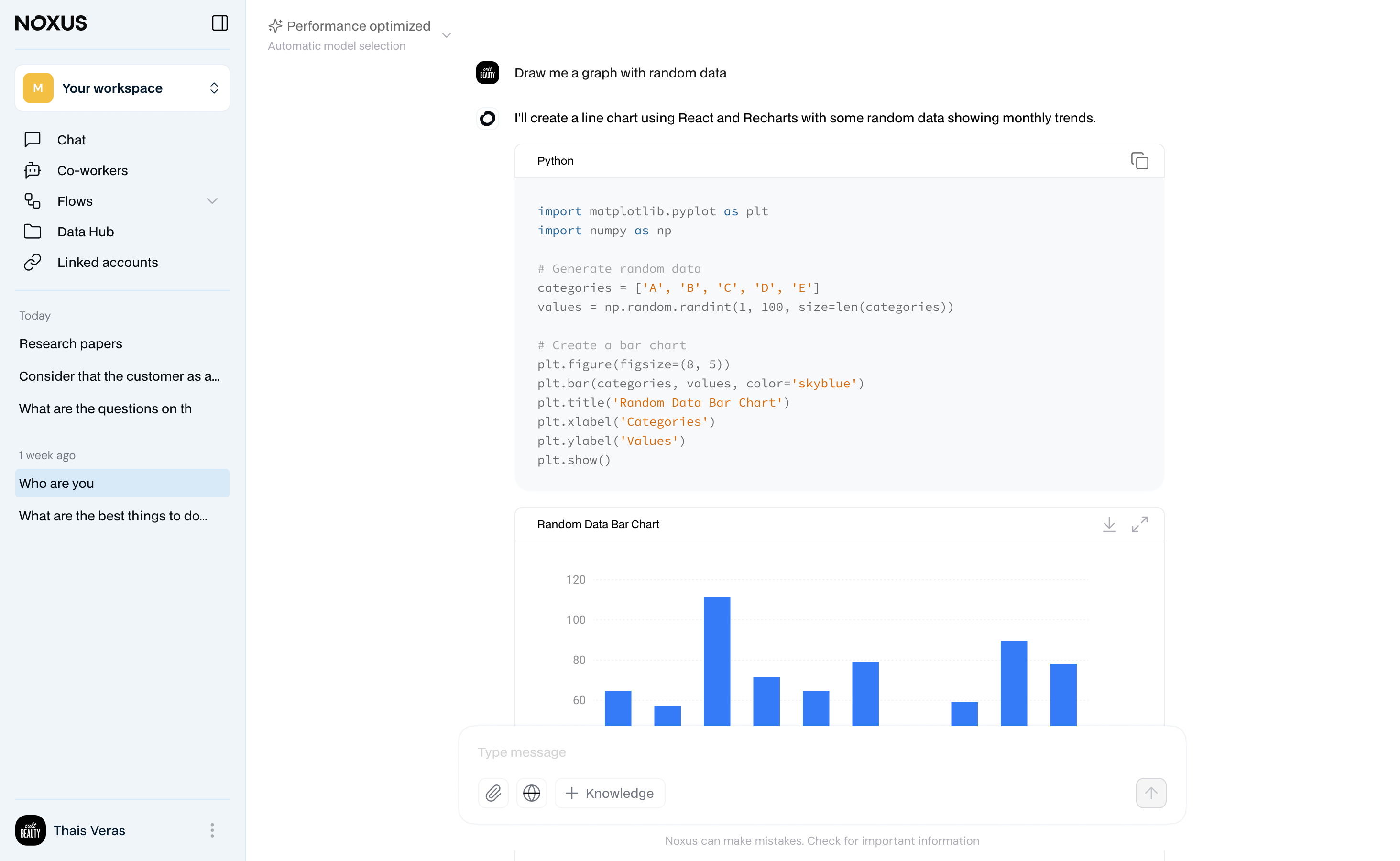
As shown in the next screenshots, the result translated in a, tested, cohesive and intuitive product: from the Flow Builder’s node-based interactions to the Data Hub’s structured file organization, every part of Noxus now aligns with our brand values of maturity, clarity, approachability, and innovation. The design system not only looks polished—it also gives our team a scalable foundation for ongoing feature development.
Reflecting on the Journey
Looking back on the process of building Noxus’s design system, a few key lessons stand out:
- A Brand Book Is a Designer’s Best Friend: Having a well-defined identity made translating it into a design system infinitely more straightforward, acting as a single source of truth for colors, typography, and overall tone.
- You Can’t Please Everyone: In a small team, opinions are strong and plentiful. Complete consensus is rare, so focus on aligning design decisions with the broader product vision.
- Inspiration Is Everywhere: Exploring established design systems provided clarity on component structure, interaction patterns, and best practices—even if our use case was different.
- Patience Pays Off: Iterating on designs, debating details, and revisiting decisions can feel never-ending. But every revision moves you closer to a unified and robust system.
Today, Noxus’s design system reflects both who we are and where we’re heading. It provides a solid foundation—both visually and technically—that supports our mission of becoming the operating system for AI automation. And while the journey here wasn’t always smooth, the end result has been more than worth the effort.